Craft show booth layout is the single biggest lever you control in a 10x10 space, and the whole game comes down to one choice: does your front read as an open doorway or a closed wall? Most vendors quietly lose sales the moment they line one straight table across the front, because that table is a barrier that keeps browsers standing in the aisle. Below are the four layout patterns that actually work in 100 square feet, where the register goes, and the fire-code and ADA numbers your plan has to hit before you worry about anything pretty.
The 10x10 reality: what 100 square feet has to hold
A standard vendor space is 10x10 feet — 100 square feet — and everything competes for it: your display, your inventory, your checkout station, a chair, and the walking room shoppers need. The common alternatives are a 10x20 double and a 10x5 half-booth, but the 10x10 is the unit most craft fairs and conventions sell.
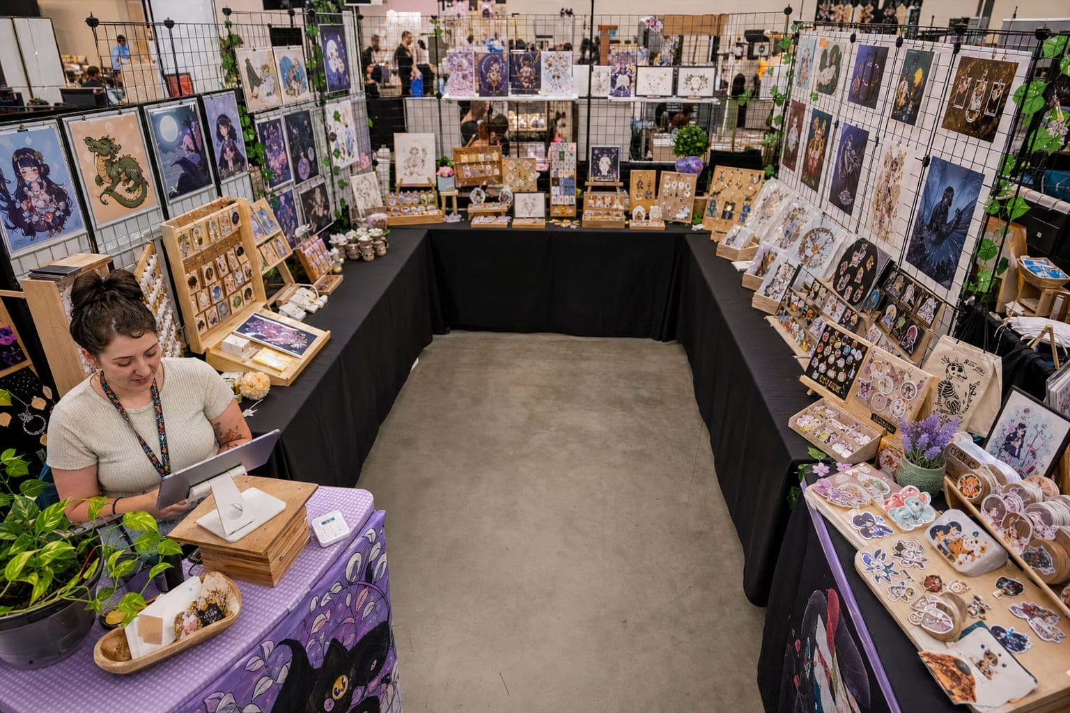
Picture the footprint as a square with the aisle running along the front (the "open" side). The three closed sides are your back wall and two side walls. The workhorse table setup is two 6-foot folding tables, or one 6-foot plus one 4-foot, arranged along those closed edges. That leaves the middle as browsing room and the front as your entrance. Where you put tables against those three walls is the entire game — and it's the first decision in any craft show booth setup guide worth following.
The four layout patterns
Nearly every effective 10x10 is a variation on four shapes:
| Layout | Where tables go | Best for |
|---|---|---|
| U-shape | Back wall + both sides, front open | Immersive, store-like browsing; the default for most vendors |
| L-shape | Back + one side | Corner booths with two open sides |
| Open-front / inverted-U | Back and both sides, front deliberately clear | Pulling foot traffic all the way in |
| Straight-front (avoid) | One table across the front | Fast setup, but it walls shoppers out |
The U-shape is the safe default: tables on the back and both sides create a three-sided room that surrounds a browser and makes your booth feel like a tiny shop. The L-shape uses the back plus one side and is ideal when you draw a corner spot with two open aisles — you open toward both. The open-front (inverted-U) keeps the same three-sided display but leaves the front entirely clear so nothing signals "stop here." The through-line across all three is the same: plan where you sit so you don't block flow, and steer shoppers toward the register.
Traffic flow: why a straight front table is a wall
Here's the counterintuitive part. A single table across the front feels efficient — you stand behind it, product faces out, done. But that table is a checkout counter and a fence at the same time. Shoppers stay in the aisle, glance at the top of the table, and keep walking. A straight front counter acts as a physical barrier between you and the browser, while open, curved, U- and L-shaped arrangements bring customers into your space where real conversations — and sales — happen.
Inside the booth, leave a clear browsing path at least two people wide so someone examining your back-wall display doesn't trap the person behind them. The moment a browser steps off the aisle and into your footprint, they've committed a little — and committed browsers buy far more than aisle-glancers. Pair the open layout with vertical display (shelving, pegboard, grid walls) so product is visible from across the aisle and does the work of stopping people before they reach you.
Rule of thumb: if a stranger can't take two full steps into your booth without turning sideways, your layout is too tight. Widen the path before you add more product.
Sightlines and anchor placement: the invariant right
There's a well-documented quirk in how people move through retail space: on entry, shoppers reliably drift right. Retail designers call it the "invariant right," and it traces back to Paco Underhill's Why We Buy. Sergio Mannino Studio breaks down why customers turn right in stores, and the takeaway for a 10x10 is direct: put your hero piece — your best, most eye-catching, highest-margin item — on the right side as someone faces your booth, because that's where their eye lands first.
From there, merchandise for eye level. Adult eye level sits around 50–60 inches, so your mid-range bestsellers belong there. Impulse and lower-priced items go lower, roughly 36–48 inches, near the front where a quick grab feels easy. And resist the urge to cram: fill fixtures to about two-thirds visual density, not edge-to-edge. Empty space around a hero piece reads as intentional; a wall packed corner to corner reads as clutter and buries the very items you most want seen. There's more on this in our roundup of convention booth display ideas that drive sales.
Where the checkout goes
Two rules govern the register, and both are about placement.
First, keep it out of the entrance. The first few steps into any space form a "decompression zone" where people are still orienting — signage, promo tables, and checkout counters placed there get ignored. Drop your register in the front and you've put it in a blind spot.
Second, put checkout in one corner or the short leg of an L, angled so you can see the whole booth from your station and shoppers naturally exit past it. That single position lets you watch inventory, greet browsers, and ring people up without body-blocking your own display.
And assume the Wi-Fi will fail. Convention halls are notorious dead zones, so your checkout has to keep working offline. Square supports card payments in Offline Mode when the connection drops, which is exactly why the checkout corner should never depend on live internet. Shipyie works the same way — it takes orders and captures shipping addresses offline and syncs when you're back on network — so a dead hotspot doesn't stall your line. If your checkout is a bottleneck, our notes on 5 ways to speed up convention booth checkout go deeper.
Aisle and exit minimums your layout must hit
Pretty doesn't matter if the fire marshal flags you. These are the numbers to respect:
- Aisles: at least 44 inches wide where the occupant load exceeds 50 people, and 36 inches for 49 or fewer. These event aisle widths come from NPS/NFPA fire and life safety requirements.
- Exit opening: a minimum of 3 feet (36 inches) wide, kept clear of tables, boxes, and cords, with 7-foot head clearance — also from the NPS/NFPA guidance above.
- Accessible route: the ADA accessibility standards set a 36-inch minimum clear width for an accessible route. Use that as the baseline for both your front opening and your interior path so a wheelchair can pass.
The practical version: keep your front opening and interior aisle at least 36 inches clear, never block your extinguisher or your own exit, and you'll satisfy both the fire code and the accessibility baseline at once. A tent that also handles wind and rain is part of this equation too — see our craft show tents vendor buying guide.
Corner booths and 10x20 doubles
A corner booth gets two open sides instead of one, which nearly doubles the foot traffic that can see in. The move is an L-shape (or inverted-L): put displays on the back and one side, and open the booth to both aisles. Don't wall off the second open side with a table — that's the whole advantage.
A 10x20 double gives you room for a true walk-in loop: displays down both long sides and the back, a wide center aisle, and checkout in a rear corner where you command the space. Same principles, more room to breathe.
Common 10x10 mistakes that quietly cost sales
- A straight table across the front — the number-one flow killer.
- Register in the entrance, where the decompression zone hides it.
- Overpacked fixtures at 100% density that bury your hero pieces.
- Everything at table height with no vertical display, so nothing shows from the aisle.
- Sitting in the front opening and blocking your own doorway.
- Blocked exits or extinguishers, which is both a sales problem and a safety violation.
Your signage has to earn its place in this layout too — prices, your story, and a QR code all belong somewhere specific, covered in craft show signage: what to put on every sign.
The Bottom Line
The best craft show booth layout for a 10x10 is an open, three-sided room — a U-shape by default, an L-shape on corners — with your hero piece on the right, your register tucked in a corner out of the entrance, and at least 36 inches of clear path so shoppers (and wheelchairs, and the fire marshal) can move through. Kill the straight front table, respect the aisle and exit minimums, and keep your checkout running offline so a dropped signal never stalls the line. Sketch it on paper before load-in, then adjust once you see which side the aisle traffic actually comes from.